We’ve been talking a lot on socials recently about the Hoolet rebrand, which made me think I’ve probably never really told the Hoolet brand story before.
Well four years in, it’s probably about time…
The brand story
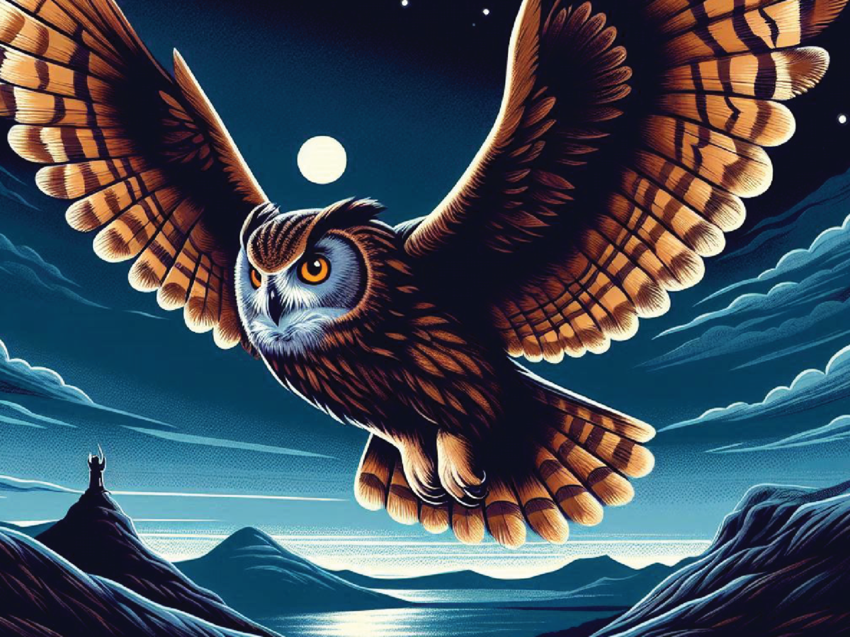
Hoolet is the Scots word for an owl.
I think I probably say that every time I introduce the brand. I love the idea and I love the word, the onomatopoeic joy in saying it. I also like the idea of Hoolet being firmly based in Scotland.
And the owl? Well, obviously there’s the inference of wisdom, but it’s less well known that the owl got this reputation from its association with Athena.
In Greek mythology, a little owl often represents or accompanies Athena, the goddess of wisdom. Its exceptional night vision symbolises Athena’s ability to “see” when others cannot and discern the truth in the shadows. And a bit of goddess-ing and female empowerment never go amiss in my book.
So the mix of Scottish, wisdom and female encapsulate what Hoolet is and what it stands for.
- Read more about the best and worst business names.
But I also love the idea of an owl in flight being able to give the necessary perspective. The understanding that by working with Hoolet, a business could discover that perspective from on high, soaring above the everyday commotion.
It also lets them swoop down on opportunities with a single-minded determination. I don’t dwell too long on talons
Also, it gave me the strapline “Hoolet: creating communications that soar”. And the opportunity to use Hoolet hoots as an account handle on socials…

The brand look
When it came to creating the brand for Hoolet, I love fonts. I am a font geek, and I love the look of Franklin Gothic Bold, which is what the logo is. It’s Hoolet written in Franklin Gothic bold. I don’t like to over-complicate what is an already great design.
- A font geek: the evidence…
The color palette consists of five colours: the first three, which are a fawn-like brown, a pale grey and a dark glossy chestnut brown, represent the feathers of an owl. The bold accent orange is the glow of an eye in the dark, and the deep dark blue is the midnight sky through which you’d find an owl swooping.

- And if you’re interested in adding some more colour to your life – read this
So that’s the brand story. But to be honest, until recently the brand consisted of a logo, a colour palette and the story behind it.
Oh and a posse (a parliament) of brave souls willing to pose with a cuddly Hoolet owl.

So when I asked Rory Doyle, a talented young graphic designer of my acquaintance, to take a look at the brand and tell me what he thought… well let’s say he’s a brave man to take up the challenge from someone who I’ve been told can hold strong views.
He came back to me with a few options, as any good designer would. My absolute favourite part was the new icon of an owl face that he incorporated into the logo. He skilfully held onto the parts I loved but just made it a whole lot better.

He also brought in some brilliant design devices, making more of the feather device. He created a feather frame, and a device as a flurry of feathers but I also love the way he translated it into practical applications that are really easy for me to use. I can now imprint the brand wherever we go anywhere and say anything. From presentations to pertinent posts, hoodies to hoardings, it’s a proper template with icon variations. I mean, who doesn’t love a winking owl?

So hats off to Rory for his sterling work. And hopefully you’ll see more of the Hoolet brand refresh in the coming weeks and months.
Hoolet is a strategic communications consultancy. Come say hello on social channels at @hoolet_hoots, or follow us on LinkedIn. You can read more blogs here.


One thought on “Hoolet: more than just a name – unveiling the brand story”
Who doesn’t love a winking owl? And who could fail to love the brand story? Franklin Gothic is my favourite font, hoolet is my favourite bird and Joanna is quite definitely the best in the business.
Comments are closed.